All the advance fields of LiveForms:
In the form edit mode, you can find Advanced fields after the Generic used fields list. Currently, we provide fourteen kinds of advance field.
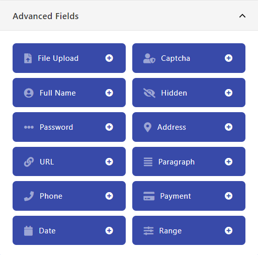
If you want to add any of them in the current form click on the plus(+) or drag and drop them to the right side form fields area.
The details about all the field are discussed below.
Table of content:
- File Upload
- Captcha
- Full Name
- Hidden
- Password
- Address
- URL
- Paragraph
- Phone
- Payment
- Date
- Range
File Upload:
If you want a user to upload a file through the form, you can use this field in the form. It allows the user to upload any file.
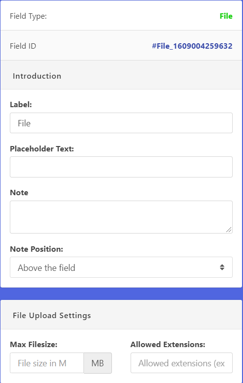
Properties of the field:
After clicking on the input field or settings icon, settings will be open, and you can find some options there.
Label:
You can refer the field name as you want.
Placeholder Text:
you can set the input box placeholder text here
Note:
The text in the note will appear for a description of the label in small font.
Note Position:
Note Position will define where the note will be placed
File Upload Settings:
For Max filesize, you can set how much size will be for the file and Allowed Extensions will help you which file you want to specifically allow like example png, jpg, pdf etc
Conditional Logic:
This section discussed here.
Required:
This section discussed here.
Captcha:
This field will generate a captcha code and user need to write it down on the field for verification purpose. You can use it with the form to ensure that any robot or bot won’t submit the form.
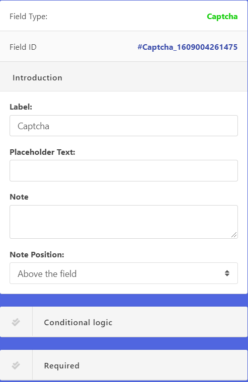
Properties of the field:
After clicking on the input field or settings icon, settings will be open, and you can find some options there.
Label:
You can refer the field name as you want.
Placeholder Text:
you can set the input box placeholder text here
Note:
The text in the note will appear for a description of the label in small font.
Note Position:
Note Position will define where the note will be placed
Conditional Logic:
This section discussed here.
Required:
This section discussed here.
Full Name:
This is an advanced field that can take input in full name format.
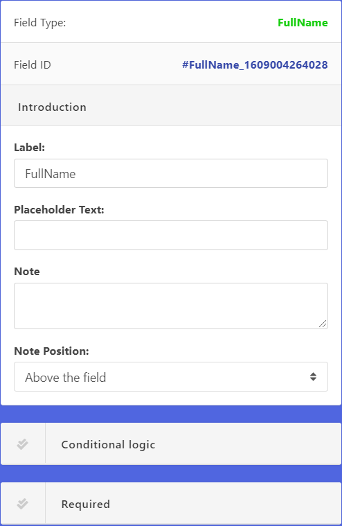
Properties of the field:
After clicking on the input field or settings icon, settings will be open, and you can find some options there.
Label:
You can refer the field name as you want.
Placeholder Text:
you can set the input box placeholder text here
Note:
The text in the note will appear for a description of the label in small font.
Note Position:
Note Position will define where the note will be placed
Conditional Logic:
This section discussed here.
Required:
This section discussed here.
Input Option:
- Title: For the title of the Name (eg. Mr, Mrs, Md)
- First name: The first name of the user
- Last Name: The last name of the user
Hidden:
This field allows you to take user hidden field with the form.
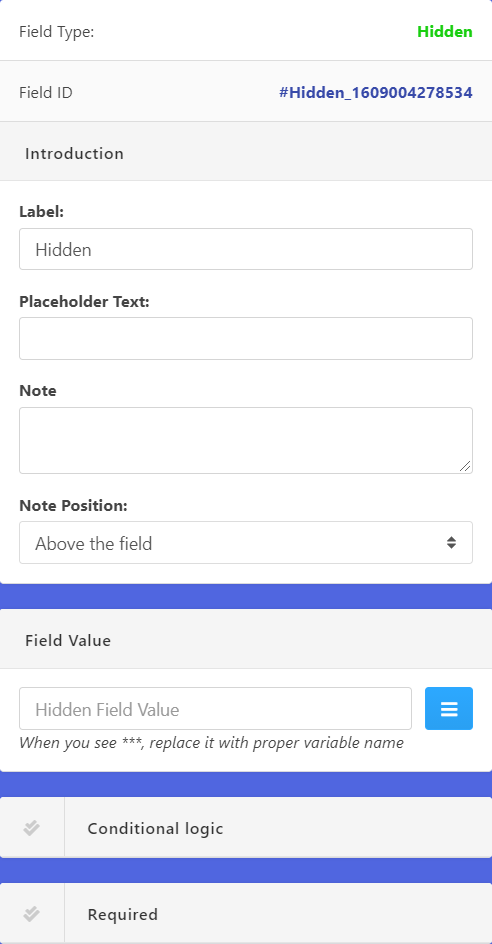
Properties of the field:
After clicking on the input field or settings icon, settings will be open, and you can find some options there.
Label:
You can refer the field name as you want.
Placeholder Text:
you can set the input box placeholder text here
Note:
The text in the note will appear for a description of the label in small font.
Note Position:
Note Position will define where the note will be placed
Field Value:
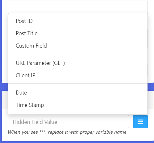
You can select here hidden field value, you can choose any of them as your requirements.
Conditional Logic:
This section discussed here.
Required:
This section discussed here.
Password:
This field will allow you to take the password from the user as well as it has confirmed password filed too
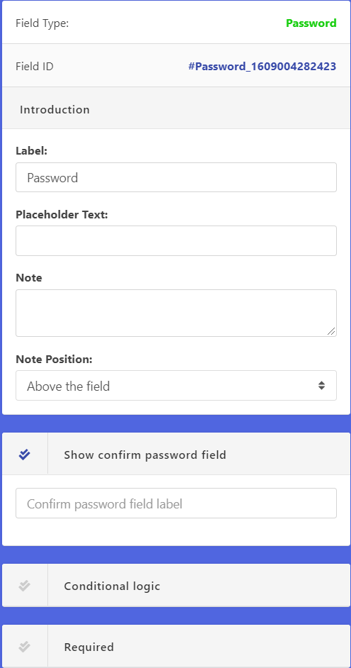
Properties of the field:
After clicking on the input field or settings icon, settings will be open, and you can find some options there.
Label:
You can refer the field name as you want.
Placeholder Text:
you can set the input box placeholder text here
Note:
The text in the note will appear for a description of the label in small font.
Note Position:
Note Position will define where the note will be placed
Show confirm password field:
After checking this option there will an option available for the user confirming the password
Conditional Logic:
This section discussed here.
Required:
This section discussed here.
Address:
This field will allow you to take input user addresses in detail
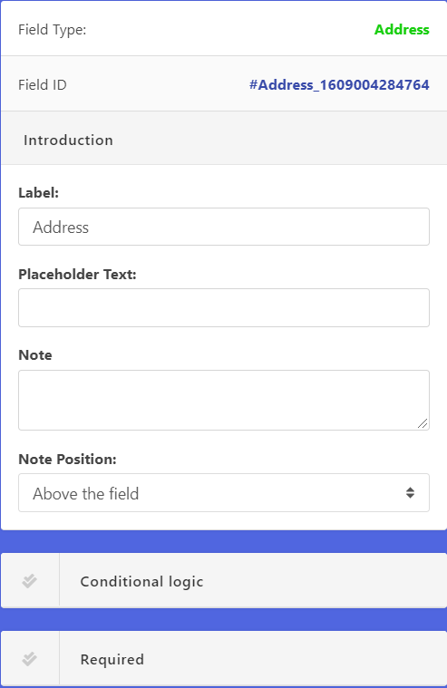
Properties of the field:
After clicking on the input field or settings icon, settings will be open, and you can find some options there.
Label:
You can refer the field name as you want.
Placeholder Text:
you can set the input box placeholder text here
Note:
The text in the note will appear for a description of the label in small font.
Note Position:
Note Position will define where the note will be placed
Conditional Logic:
This section discussed here.
Required:
This section discussed here.
Input Option:
- Address 1: For the first line of street address
- Address 2: For the second line of street address
- City: The name of the city
- Country: This is the auto-generated select field for the country name
- State: This is auto-generated for the specific country to select state name
URL:
This is a single-line text field with URL validation built-in. It will only take URL (eg. http://www.example.com) as input.
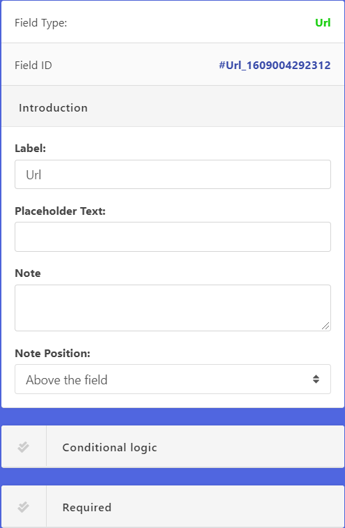
Properties of the field:
After clicking on the input field or settings icon, settings will be open, and you can find some options there.
Label:
You can refer the field name as you want.
Placeholder Text:
you can set the input box placeholder text here
Note:
The text in the note will appear for a description of the label in small font.
Note Position:
Note Position will define where the note will be placed
Conditional Logic:
This section discussed here.
Required:
This section discussed here.
Paragraph:
You can place paragraph or text in the form with this field. It is not an input field. If you have any instruction or anything you can write it here and place wherever you want in the form.
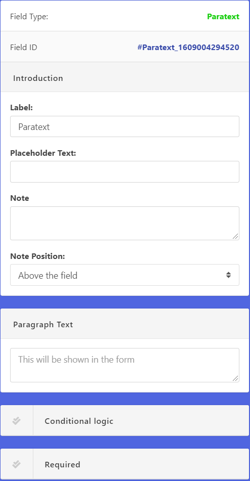
Properties of the field:
After clicking on the input field or settings icon, settings will be open, and you can find some options there.
Label:
You can refer the field name as you want.
Placeholder Text:
you can set the input box placeholder text here
Note:
The text in the note will appear for a description of the label in small font.
Note Position:
Note Position will define where the note will be placed
Paragraph text:
You may put text in this box what you want to be shown in the form.
Conditional Logic:
This section discussed here.
Required:
This section discussed here.
Phone:
This field is used to take the phone number from the user.
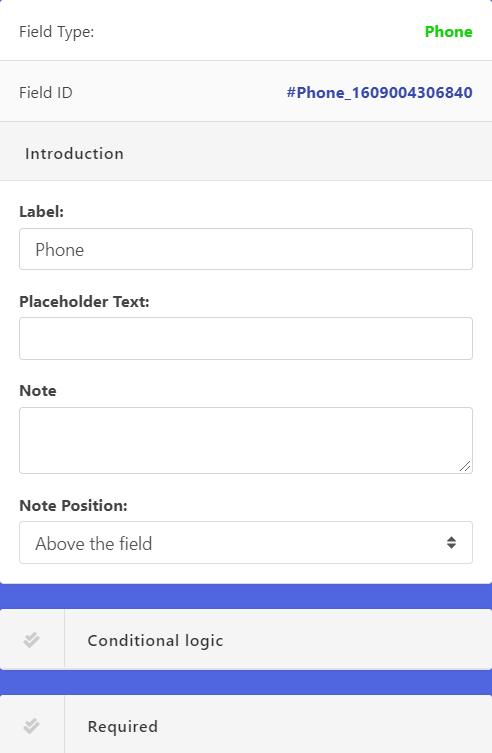
Properties of the field:
After clicking on the input field or settings icon, settings will be open, and you can find some options there.
Label:
You can refer the field name as you want.
Placeholder Text:
you can set the input box placeholder text here
Note:
The text in the note will appear for a description of the label in small font.
Note Position:
Note Position will define where the note will be placed
Paragraph text:
You may put text in this box what you want to be shown in the form.
Conditional Logic:
This section discussed here.
Required:
This section discussed here.
Input Options:
- Country: Used for taking the country name
- Area: Used for area name or number
- Number: For the phone number
Payment:
With this field, you can take payment through the form upon submission. Paypal is a built-in payment gateway for this field.
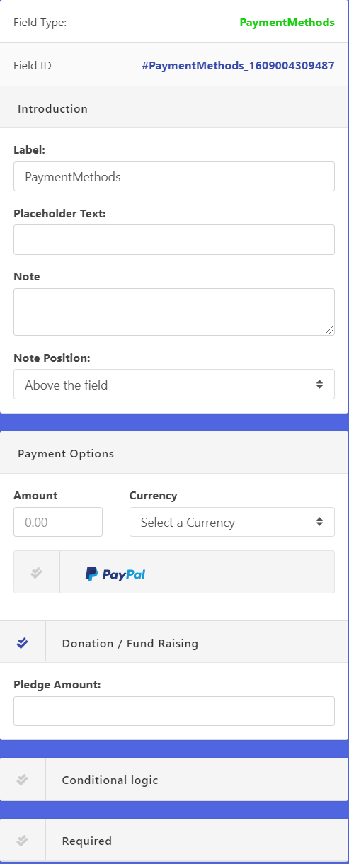
Properties of the field:
After clicking on the input field or settings icon, settings will be open, and you can find some options there.
Label:
You can refer the field name as you want.
Placeholder Text:
you can set the input box placeholder text here
Note:
The text in the note will appear for a description of the label in small font.
Note Position:
Note Position will define where the note will be placed
Amount:
The amount of money you want to receive with the form.
Currency:
The currency of the amount. you can choose as your requirements from the select dropdown menu
Donation / Fund Raising:
you can check this option if there any Pledge Amount
Conditional Logic:
This section discussed here.
Required:
This section discussed here.
Date:
With this field, you can take date and time input with the form
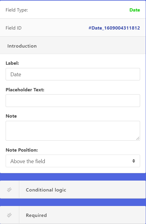
Properties of the field:
After clicking on the input field or settings icon, settings will be open, and you can find some options there.
Label:
You can refer the field name as you want.
Placeholder Text:
you can set the input box placeholder text here
Note:
The text in the note will appear for a description of the label in small font.
Note Position:
Note Position will define where the note will be placed
Paragraph text:
You may put text in this box what you want to be shown in the form.
Conditional Logic:
This section discussed here.
Required:
This section discussed here.
Range:
User will be able to take a range input with this field,
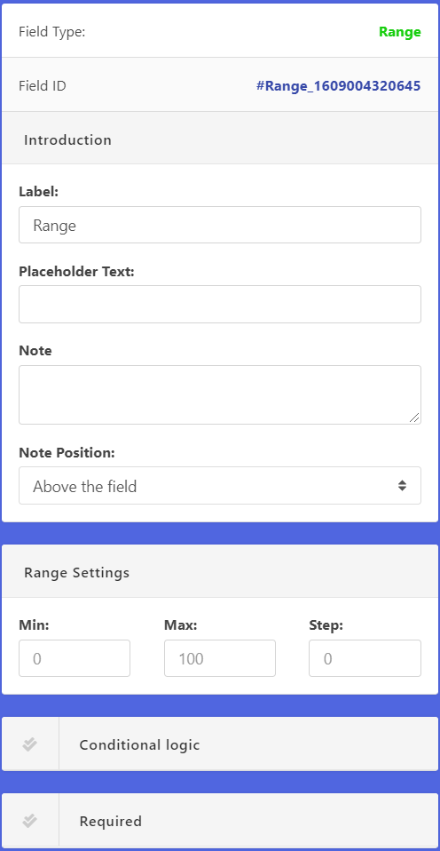
Properties of the field:
After clicking on the input field or settings icon, settings will be open, and you can find some options there.
Label:
You can refer the field name as you want.
Placeholder Text:
you can set the input box placeholder text here
Note:
The text in the note will appear for a description of the label in small font.
Note Position:
Note Position will define where the note will be placed
Range Settings:
With the Min, Max and Step value you can adjust the range settings
Conditional Logic:
This section discussed here.
Required:
This section discussed here.
All the advance fields of LiveForms:
In the form edit mode, you can find Advanced fields after the Generic used fields list. Currently, we provide fourteen kinds of advance field.
If you want to add any of them in the current form click on the plus(+) or drag and drop them to the right side form fields area.
The details about all the field are discussed below.
Table of content:
File Upload:
If you want a user to upload a file through the form, you can use this field in the form. It allows the user to upload any file.
Properties of the field:
After clicking on the input field or settings icon, settings will be open, and you can find some options there.
Label:
You can refer the field name as you want.
Placeholder Text:
you can set the input box placeholder text here
Note:
The text in the note will appear for a description of the label in small font.
Note Position:
Note Position will define where the note will be placed
File Upload Settings:
For Max filesize, you can set how much size will be for the file and Allowed Extensions will help you which file you want to specifically allow like example png, jpg, pdf etc
Conditional Logic:
This section discussed here.
Required:
This section discussed here.
Captcha:
This field will generate a captcha code and user need to write it down on the field for verification purpose. You can use it with the form to ensure that any robot or bot won’t submit the form.
Properties of the field:
After clicking on the input field or settings icon, settings will be open, and you can find some options there.
Label:
You can refer the field name as you want.
Placeholder Text:
you can set the input box placeholder text here
Note:
The text in the note will appear for a description of the label in small font.
Note Position:
Note Position will define where the note will be placed
Conditional Logic:
This section discussed here.
Required:
This section discussed here.
Full Name:
This is an advanced field that can take input in full name format.
Properties of the field:
After clicking on the input field or settings icon, settings will be open, and you can find some options there.
Label:
You can refer the field name as you want.
Placeholder Text:
you can set the input box placeholder text here
Note:
The text in the note will appear for a description of the label in small font.
Note Position:
Note Position will define where the note will be placed
Conditional Logic:
This section discussed here.
Required:
This section discussed here.
Input Option:
Hidden:
This field allows you to take user hidden field with the form.
Properties of the field:
After clicking on the input field or settings icon, settings will be open, and you can find some options there.
Label:
You can refer the field name as you want.
Placeholder Text:
you can set the input box placeholder text here
Note:
The text in the note will appear for a description of the label in small font.
Note Position:
Note Position will define where the note will be placed
Field Value:
You can select here hidden field value, you can choose any of them as your requirements.
Conditional Logic:
This section discussed here.
Required:
This section discussed here.
Password:
This field will allow you to take the password from the user as well as it has confirmed password filed too
Properties of the field:
After clicking on the input field or settings icon, settings will be open, and you can find some options there.
Label:
You can refer the field name as you want.
Placeholder Text:
you can set the input box placeholder text here
Note:
The text in the note will appear for a description of the label in small font.
Note Position:
Note Position will define where the note will be placed
Show confirm password field:
After checking this option there will an option available for the user confirming the password
Conditional Logic:
This section discussed here.
Required:
This section discussed here.
Address:
This field will allow you to take input user addresses in detail
Properties of the field:
After clicking on the input field or settings icon, settings will be open, and you can find some options there.
Label:
You can refer the field name as you want.
Placeholder Text:
you can set the input box placeholder text here
Note:
The text in the note will appear for a description of the label in small font.
Note Position:
Note Position will define where the note will be placed
Conditional Logic:
This section discussed here.
Required:
This section discussed here.
Input Option:
URL:
This is a single-line text field with URL validation built-in. It will only take URL (eg. http://www.example.com) as input.
Properties of the field:
After clicking on the input field or settings icon, settings will be open, and you can find some options there.
Label:
You can refer the field name as you want.
Placeholder Text:
you can set the input box placeholder text here
Note:
The text in the note will appear for a description of the label in small font.
Note Position:
Note Position will define where the note will be placed
Conditional Logic:
This section discussed here.
Required:
This section discussed here.
Paragraph:
You can place paragraph or text in the form with this field. It is not an input field. If you have any instruction or anything you can write it here and place wherever you want in the form.
Properties of the field:
After clicking on the input field or settings icon, settings will be open, and you can find some options there.
Label:
You can refer the field name as you want.
Placeholder Text:
you can set the input box placeholder text here
Note:
The text in the note will appear for a description of the label in small font.
Note Position:
Note Position will define where the note will be placed
Paragraph text:
You may put text in this box what you want to be shown in the form.
Conditional Logic:
This section discussed here.
Required:
This section discussed here.
Phone:
This field is used to take the phone number from the user.
Properties of the field:
After clicking on the input field or settings icon, settings will be open, and you can find some options there.
Label:
You can refer the field name as you want.
Placeholder Text:
you can set the input box placeholder text here
Note:
The text in the note will appear for a description of the label in small font.
Note Position:
Note Position will define where the note will be placed
Paragraph text:
You may put text in this box what you want to be shown in the form.
Conditional Logic:
This section discussed here.
Required:
This section discussed here.
Input Options:
Payment:
With this field, you can take payment through the form upon submission. Paypal is a built-in payment gateway for this field.
Properties of the field:
After clicking on the input field or settings icon, settings will be open, and you can find some options there.
Label:
You can refer the field name as you want.
Placeholder Text:
you can set the input box placeholder text here
Note:
The text in the note will appear for a description of the label in small font.
Note Position:
Note Position will define where the note will be placed
Amount:
The amount of money you want to receive with the form.
Currency:
The currency of the amount. you can choose as your requirements from the select dropdown menu
Donation / Fund Raising:
you can check this option if there any Pledge Amount
Conditional Logic:
This section discussed here.
Required:
This section discussed here.
Date:
With this field, you can take date and time input with the form
Properties of the field:
After clicking on the input field or settings icon, settings will be open, and you can find some options there.
Label:
You can refer the field name as you want.
Placeholder Text:
you can set the input box placeholder text here
Note:
The text in the note will appear for a description of the label in small font.
Note Position:
Note Position will define where the note will be placed
Paragraph text:
You may put text in this box what you want to be shown in the form.
Conditional Logic:
This section discussed here.
Required:
This section discussed here.
Range:
User will be able to take a range input with this field,
Properties of the field:
After clicking on the input field or settings icon, settings will be open, and you can find some options there.
Label:
You can refer the field name as you want.
Placeholder Text:
you can set the input box placeholder text here
Note:
The text in the note will appear for a description of the label in small font.
Note Position:
Note Position will define where the note will be placed
Range Settings:
With the Min, Max and Step value you can adjust the range settings
Conditional Logic:
This section discussed here.
Required:
This section discussed here.
hemel