Fields Settings of a form:
In the form edit mode, you can find a few settings for every form field. After clicking on the input field or settings icon, settings will be open.
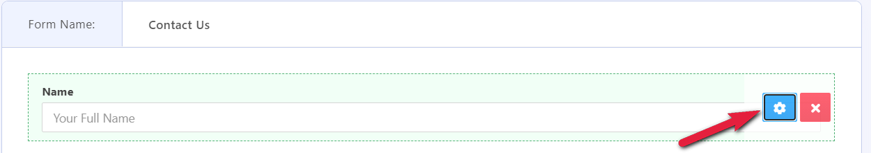
You can find some common field settings available there. It should be mostly same for every field. Few special fields have some unique options. That is discussed in details fields section.
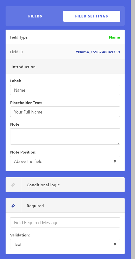
Table of content:
- Label
- Placeholder Text
- Note
- Conditional logic
- Required
- Validation
Label:
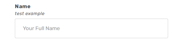
You can refer the field name as you want. This is the title of any field. You can place any string here.
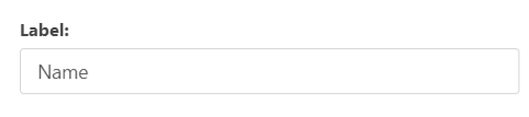
It will appear top of the field in bold text as a heading.

You can also leave it blank if you don’t want to give any title for the field. An example use of a blank label is in paragraph field.
Placeholder Text:
You are also able to edit the placeholder text Your Full Name from Placeholder Text option
Note:
This field text will appear above/below the label of the form.
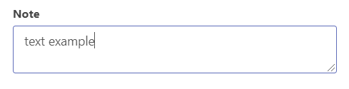
The text of the field will show up in grey colour in the form in small text than the title.
Use this option to clarify user about the field of the form.
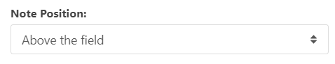
Note Position will define where the note will be placed,
Conditional logic:
This is an advanced option for any field of the form which is built-in. You can set up some logic to show and hide any field in the form based on the input.
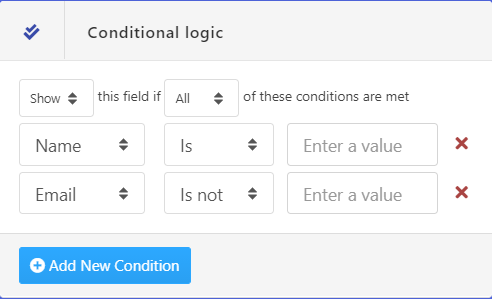
You can add a condition for any field as much you want. You can put the field status “show” or “hide” for “all” or “any” condition matched for any user input.
Condition Options:
- Show: Show the current field
- Hide: Hide the current field
- All: Match all the condition below
- Any: Match any of one condition below
Conditions:
- Plus sign (+): Add a new condition
- Cross sign ( x ): Remove the condition
- Select a field: Select a field from the current form to set the condition
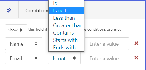
- Is: To check the selected field input is a name or email
- Is not: To check the selected field input is not name or email
- Less than: To check the selected field input is less than any value
- Greater than: To check the selected field input is greater than any value
- Contains: To check the selected field input contain any string or value
- Starts with: To check the selected field input start with any string or value
- Ends with: To check the selected field input ends with specific string or value
- Enter a value: put the value here to check the condition
You can use it to make a complex form simplified. You can manage the form field upon the user input.
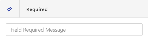
Required:
This is a checkbox. If checked, this will ensure that the user completed the field before allowing the form to be submitted.
Field Required Message: You can place a message which will show when a user tries to submit the form leaving the field blank.
Validation:
If you check the field as required, you can see the data validation option appears.
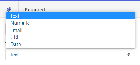
You can use validation to validate the field data upon submission.
Options:
- Text: Validate the field input as text
- Numeric: Validate the field input as a number
- Email: Validate the field input email address
- URL: Validate the field input as URL (e.g http://www.example.com)
- Date: Validate the field input as Date (eg. mm-dd-yy)
Few Extra options come with special fields. Which is being discussed in fields sections.
Fields Settings of a form:
In the form edit mode, you can find a few settings for every form field. After clicking on the input field or settings icon, settings will be open.
You can find some common field settings available there. It should be mostly same for every field. Few special fields have some unique options. That is discussed in details fields section.
Table of content:
Label:
You can refer the field name as you want. This is the title of any field. You can place any string here.
It will appear top of the field in bold text as a heading.
You can also leave it blank if you don’t want to give any title for the field. An example use of a blank label is in paragraph field.
Placeholder Text:
You are also able to edit the placeholder text Your Full Name from Placeholder Text option
Note:
This field text will appear above/below the label of the form.
The text of the field will show up in grey colour in the form in small text than the title.
Use this option to clarify user about the field of the form.
Note Position will define where the note will be placed,
Conditional logic:
This is an advanced option for any field of the form which is built-in. You can set up some logic to show and hide any field in the form based on the input.
You can add a condition for any field as much you want. You can put the field status “show” or “hide” for “all” or “any” condition matched for any user input.
Condition Options:
Conditions:
You can use it to make a complex form simplified. You can manage the form field upon the user input.
Required:
This is a checkbox. If checked, this will ensure that the user completed the field before allowing the form to be submitted.
Field Required Message: You can place a message which will show when a user tries to submit the form leaving the field blank.
Validation:
If you check the field as required, you can see the data validation option appears.
You can use validation to validate the field data upon submission.
Options:
Few Extra options come with special fields. Which is being discussed in fields sections.
hemel